Branding + Webdesign

Thomas Fence Company has been serving the wonderful community of Southern Maryland for more than 40 years. They started as a family business and have bloomed into a company that’s 35-people strong and growing.
Thomas Fence Co. is dedicated to provide you with the most professional fencing solutions for your needs.
Challenge:
Thomas Fence Co. was looking for a re-brand of their existing company and a redesign of their website to better serve the needs of their customers. Their existing website had some mixed branding going on between colors, and other design elements.
The rebrand and redesign of the website would aim to better align the creative so that everything was consistent across email, print and web.


The Results
The original website had the green and white logo and also used a fair amount of orange and yellow as well as an additional shade of green across the website.
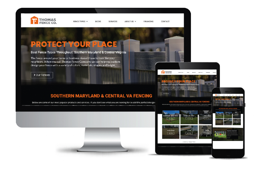
We redesigned the logo and changed the color palette opting for the orange as the primary color and included a couple shades of grey, while eliminating the greens and yellow to simplify the overall palette.
The logo was simplified to a “T” and an added shape to form the letter “F” for “Thomas Fence” with an orange picket shape which also resembles a house.
We also introduced the tagline “Protect Your Place” which helps reinforce the house shape in the logo mark, and it all comes together to create a much more modern, clean, and simple design than the previous mark.
Before & After
What We Did:
- Reduced the overall color palette
- Redesigned and modernized the logo
- Used more imagery on the website
- Included more before & after examples of past work
- Made the website more mobile friendly
If you have any questions about this project or any of our work, don’t hesitate to reach out!
Drag to see the transformation
